Your browser utility wants to be a floating palette
Late-90s desktop paradigms may suit single-purpose browser tools better than modern minimal UI.
Modern browser utilities default to progressive disclosure and minimal surfaces. Cards, centered content, generous whitespace, hidden settings. These patterns work for browsing — for exploring, scrolling, discovering. But single-purpose tools used in focused bursts may work better with the opposite: dense layouts, always-visible information, persistent tool palettes. I built PDF-A-go-slim to try it out.
tl;dr
- Browser utilities are used in focused bursts, not browsed casually
- Mac OS 8 floating palettes were designed for exactly this use pattern
- PostHog and Poolsuite show retro desktop metaphors work for developer audiences
- "Structure over skin" — borrow the layout grammar, not pixel art
The hypothesis#
Most web tools today follow the same playbook: a clean hero area, a single primary action, settings tucked behind a gear icon, results replacing the input. This works when users are exploring. It falls apart when they're doing one job.
When someone drops a PDF on an optimizer, they want to see settings, progress, results, and file details simultaneously. They're not exploring. They're not browsing. They opened a tab, did one thing, and closed it. The whole interaction lasts maybe 30 seconds.
Progressive disclosure assumes the user needs guidance through a sequence. Utility users already know what they want. They need information density, not a funnel. Everything on screen at once — the same way a carpenter wants all their tools on the bench, not locked in drawers.
Floating windows were designed for this#
The Apple Macintosh Human Interface Guidelines (1995) — the "Platinum" HIG — dedicated a section to floating windows (Chapter 5, pp. 105-106). These were specified for tool palettes: thinner chrome than document windows, always visible alongside the main content, brought to front on click but never stealing focus.
The intent was explicit: tool settings should stay visible while you work on the document. Color picker, brush options, layers panel — all on screen at once, no tabs or menus required.
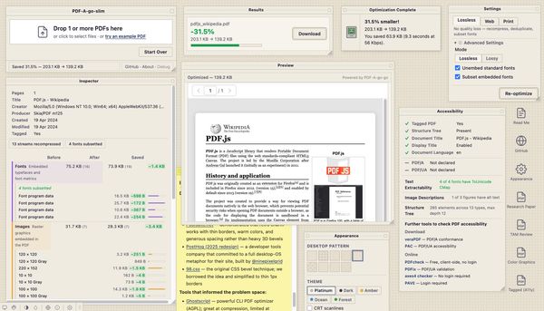
PDF-A-go-slim borrows this directly. A main document window with a persistent drop zone, and five floating draggable palettes: Settings, Results, Inspector, Preview, and Accessibility. Each palette uses WindowShade — double-click the title bar to collapse it to just a strip. Arrange your workspace once and everything stays put.
This isn't nostalgia. The HIG solved a real interaction problem: how to keep secondary controls visible during a focused task. That problem didn't go away when we moved to the browser.
PostHog validated the direction, Poolsuite showed the path#
In 2025, PostHog — a developer analytics company — redesigned their entire marketing site as a Windows-style desktop OS in the browser. Draggable windows, a start menu, a screensaver, a functional text editor, games in the trash folder. The project was built by @ninepixelgrid over six months.
A serious developer tools company independently chose the retro desktop metaphor and committed to it fully. That's worth paying attention to. The Hacker News discussion was largely positive — developers liked the personality and craft.
Poolsuite showed the complementary lesson. Retro charm doesn't require heavy 3D bevels and pixel-perfect OS recreation. Thin borders, warm cream colors, and minimal chrome. It feels vintage without feeling heavy. That shaped PDF-A-go-slim's initial direction.
Structure over skin#
Three design principles guide the retro direction:
1. Borrow the layout grammar, not pixel art. The Mac OS 8 reference is here for its spatial model — floating palettes, persistent tool windows, information always on screen. No pixel fonts, no full OS recreation.
2. Visual elements provide function. Striped title bars distinguish palettes from the document window. Sunken panels mark input areas. A status bar at the bottom shows what's happening. These are borrowed because they work, not because they look retro. Typically even the playful extras give functional boost.
3. Modern underneath. It uses system fonts, CSS custom properties, semantic HTML, and responsive layout. The aesthetic is a styling layer. The app works without it.
Concrete HIG patterns applied: WindowShade for palette collapse. Upfront information display (inspector categories expand by default, stats always visible). Dense property-sheet layouts with compact controls. Rich status bars showing pass labels and file counters during processing. A persistent drop zone that stays visible — just dimmed — during optimization.
The result is a zero-scroll, single-page environment. Five palettes, an object inspector, an accessibility audit, a live PDF preview, optimization controls, theme switching, and desktop icons for sample PDFs — all visible at once without scrolling. A conventional stacked layout would need a long page and constant back-and-forth to show the same information. Floating palettes give you the space for both serious functionality and playful extras without either one crowding the other out.
On mobile, the palettes stack vertically. Still collapsible, not draggable. It works because the underlying HTML is semantic — the floating palette positioning is just CSS.
What not to borrow#
The HN criticism of PostHog provides useful guardrails:
- Don't override native browser behavior. PostHog's custom right-click menu broke the browser context menu. PDF-A-go-slim leaves native interactions alone.
- Keyboard-accessible controls. All buttons, tabs, and interactive elements are reachable by keyboard. Drag is a convenience, not a requirement.
- Small bundle. PostHog's implementation caused high CPU during drags and slow mobile loads. PDF-A-go-slim uses vanilla JS for dragging; the WASM font subsetter lazy-loads only when needed.
- Semantic HTML underneath. Screen readers should see a form with fieldsets, not a desktop operating system.
Remove the CSS and you still have a functional, accessible tool. The retro is a layer on top, not load-bearing.
Since launch, the retro direction keeps pulling in more: a Mac OS 8-style menu bar, classic system sounds (Sosumi, Quack, Wild Eep — the originals, curated by Steven Jay Cohen), a Stickies palette, and a CRT scanline overlay. Each one started as a joke and turned out to make the tool more engaging to use.
An experiment, not a manifesto#
This is one tool testing one hypothesis: that dense, always-visible layouts suit focused utility work better than progressive disclosure. The density feels right for something you open, use for 30 seconds, and close. Whether it scales to more complex tools is a different question. I don't have metrics to validate any of this — it's a side project, and honestly, I also just wanted to have some fun building something with personality.
If you want to try the tool, go have fun.
In hindsight, I should have used an existing browser window manager instead of rolling my own — the same way real desktop apps lean on OS-level window management rather than reimplementing it. That would push the "web as OS" idea from aesthetic into architecture.
You can read about how it approaches PDF stripping in the companion introduction post. Full credits for design inspirations, sound sources, and tools that informed the project are in the README.
 people found this useful