 iBook G4 background image
 In a career of 20 years, the more things change the more they stay the same.
Last weekend I stumbled upon a folder of clips from my newspaper work, bringing the realisation it's been 20 years since my first newspaper gig in January 2000.
How different things seem now.
It's hard to not notice the change in technology and speed. Partly that’s from moving from infographics for print-focused newspapers (example) to digital publishing.
But in print publishing and online, technology changes have been tremendous — so much so you’d think it was the change.
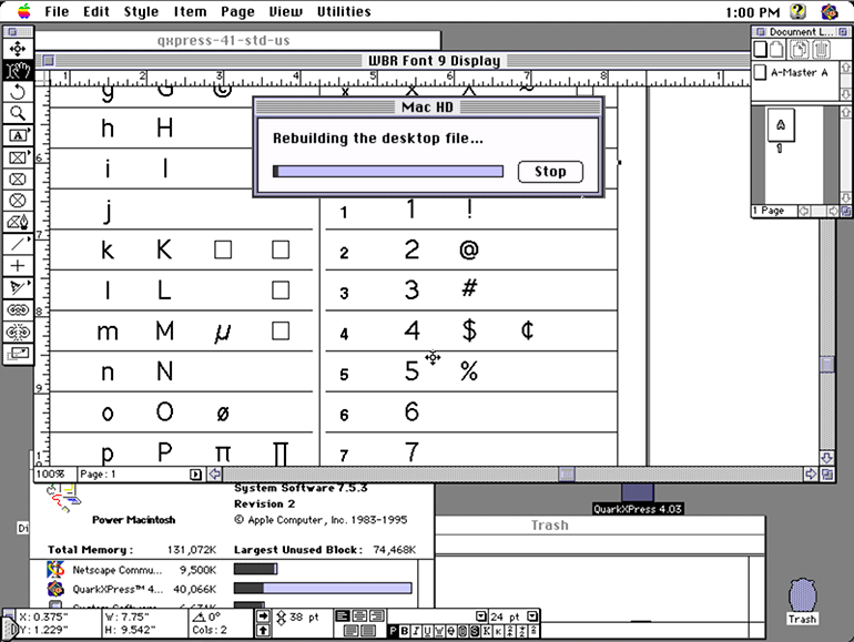
My daily software in 2000 was Quark 4 on Mac OS 7. I don’t think there's anything about that duo to be nostalgic for, other than that a fragile software environment encouraged you to focus. Or you could use "cooperative" multitasking that would eat away at your dozens of MBs of RAM and likely bring a reboot.
You were always one bad PostScript ad placement away from a system lock and losing 30 minutes of work.
Fancier things like Quark 5 and Adobe's InDesign were already shaking things up (did I ever want that optical kerning), but they were too new and simply weren’t trusted for our daily production needs and printing and waxing.
From a MacWorld column in January 1999:
InDesign is that it runs relatively briskly, particularly with long documents on G3 or better machines. Still, I'm the first to admit that InDesign's recommended system requirements — the list includes a G3 processor, OS 8.5 or later, and 128MB of RAM — are excessive. (Quark recommends that XPress users have 10MB of RAM.) I would be a bald-faced liar if I didn't admit that XPress fares better on slower systems.
But the topic is typesetting, not performance.
And there were still very analogue parts of the workflow, like lifting and pasting ads and copy.
Improving technology brought faster iteration cycles. Particularly in 2008 when I switched from working for newspapers to an online-only publication.
Speed and features were everything we needed, at least it felt that way.
The siren call of the early web tools#
Although my years in print publishing until 2008 were filled machine-locking system errors and lifting and re-waxing ads from yesterday’s edition, the web had its own horrors waiting behind a veneer of instant publishing.
The acronym WYSIWYG still haunts web publishing in 2020.
If you designed print documents you know the importance of using your document styles to manage text properties and images, however it was a concept that didn't really exist for the web until CSS arrived in 1996 — it was a while before CSS could truly empower layout.
Internet Explorer would dominate. We'd have to wait until the mid-2000s for meaningful CSS innovations to arrive.
It was a rough time.
Fortunately, I won’t have to retell it all, with serendipitous timing, developer Evelyn Woods has written a retrospective on the CSS and the web dating from a similar time period, in part:
I’ve been taking for granted that most folks doing web stuff still remember those days, or at least the decade that followed, but I think that assumption might be a wee bit out of date. Some time ago I encountered a tweet marvelling at what we had to do without
border-radius.I’m here to tell all of you to get off my lawn. Here’s a history of CSS and web design, as I remember it.
New and incredible features were coming all the time (oh how Firebug was magical), but there were so few established best practices and fewer people to get good advice from. And software didn't always point you in the best direction.
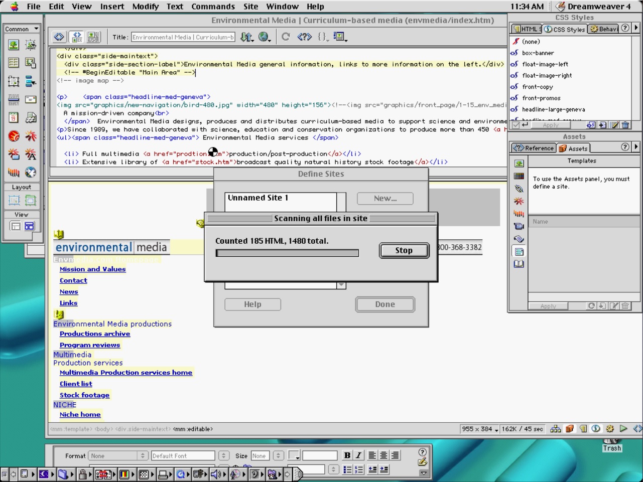
Why use code templates and partials? Instead you could use Dreamweaver's library and export hundreds of pages in Word-like interface! ... It will only be error prone and ridiculously slow.
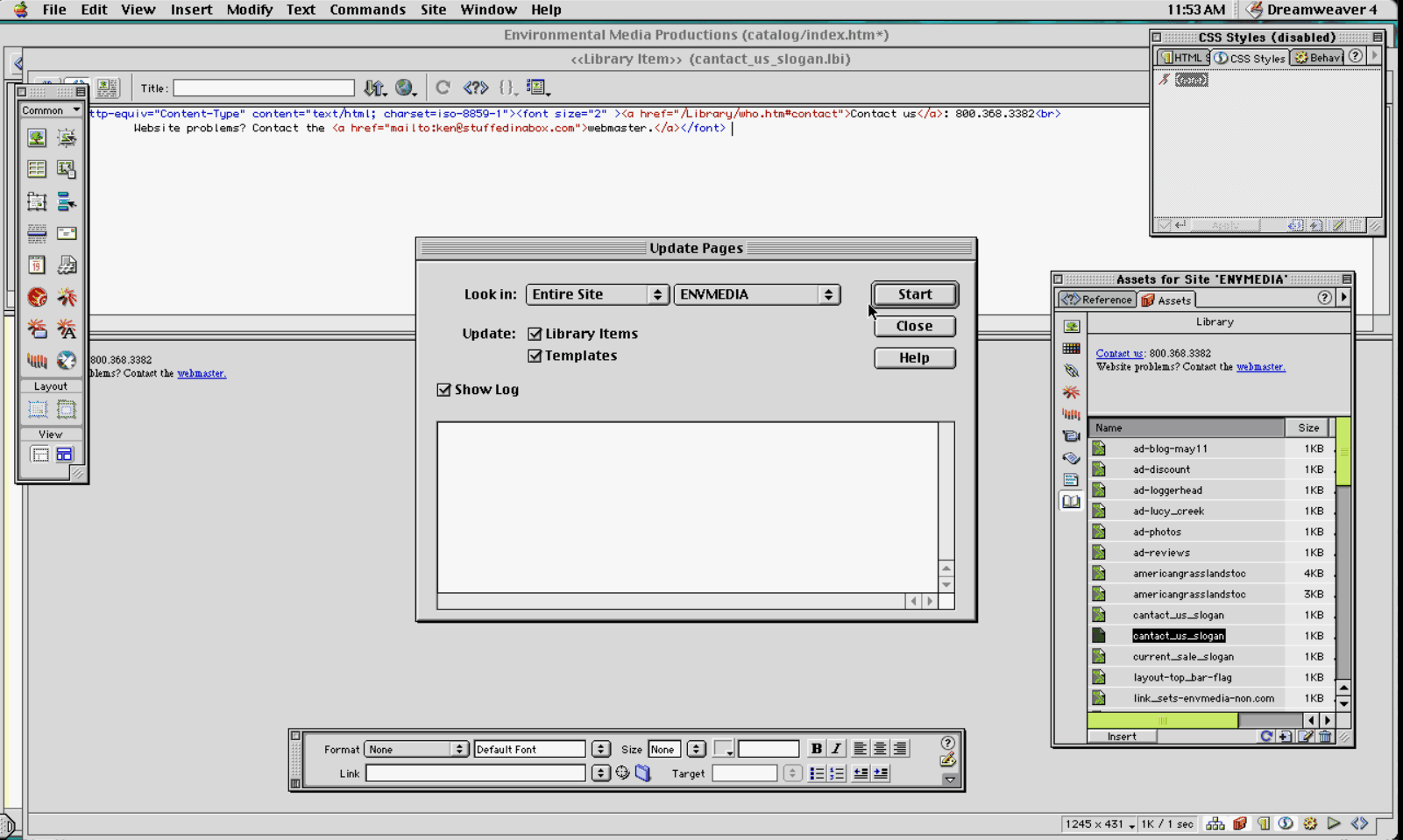
The tools and their developers did their best to fill the gaps, but if I never have to upload a site by FTP again, it will be too soon.
I have nostalgia for the process of print publishing, I don’t have that for websites of the same period. Sure, there was the novelty of your first few small websites — but beyond a few pages, the horrors of WYSIWYG, cgi-bin, proprietary browser features and more lay in wait.
Digital was chaos of new-ness, at least print had far more years of processes to learn from.
How do we do better?#
From the early-mid 2000s the tools are vastly better. They amplify our ability to produce far more stuff in 24 hours, but they don't help us ensure we're going in the right direction.
Producing the right stuff is no easier than it was for the web in 2004 or for print.
Thanks to better tools we can take our time savings and refocus on the fundamental and universal hard problem: what are we trying to achieve here?
Addendum: it's not just publishing's problem#
The increasing capability of technology has often been helpful and sometimes quite un-helpful.
As CDs (and later DVDs) became common they made it easy for software sizes to grow and grow.
Dreamweaver 4 was roughly 15 MB in size, while its successor came on a CD and needed 140 MB. From a distribution perspective it's a reasonable thing to do, but bigger installs meant more space occupied on your computer's hard drive and more data to be read off a spinning hard drive.
Often the convenience of the developer was a slowdown for users.
Web publishing saw similarly with the arrival of faster internet speeds, allowing us website makers to spend less time optimising imagery and assets.
The point?
Increased technical ability allows us to do more, but it also allows a deemphasis on optimisation. Users pay with computers that seem slower and less capable. It costs users by making an internet connection and CPU upgrade feel more critical. And it costs real money on metered data plans.
It's a feeling echoed by the recent re-launch of a famous real-time strategy game, Warcraft 3.
I enjoyed playing the other games in the series in the '90s and Warcraft III launched in 2002 with new 3D graphics, a feature I had often avoided in games as early 3D games suffered from issues around camera positioning and poor performance and unpolished graphics. However Warcraft III was implemented well and had a compelling story. It opened me to more 3D games.
Fast forward to 2020 and Warcraft III was relaunched in a remastered edition: Warcraft III Reforged. With two decades of improving performance and lessons learned about gaming interfaces, there were many opportunities for a fantastic remaster.
But much like the Star Wars prequel trilogy, more technology does not always mean better. Keyboard and mouse controls were not improved and felt more dated as keyboard layouts changed in the passing years, 3D visuals were un-improved looking flat and muddy, popular features removed, and the install size ballooned from 1.3 GB to 23 GB; Ars Technica notes:
It's all but impossible to compare individual 3D models between the old and new versions and state that the older ones are superior. Rather, the issue boils down to how all of these new assets come together on the battlefield.
Color saturation sees the terrain's soup of green and blue blur together, without any recognizable boost to unit or terrain clarity offered by details such as individual blades of grass. The lower-poly version at least made its roads, cobblestone paths, and other game-world clutter more discrete for the sake of instantly recognizable paths and obstacles.
And Polygon also notes:
Hitting the Esc key doesn’t bring up the main settings menu. Instead, I had to hunt for it for a couple of seconds — it’s mapped to F10. This isn’t a big deal, but it’s a sign of how the game doesn’t seem to have been tested and improved for a modern user experience.
As with the web, it's easy to make software look better while ignoring its technical performance and if we're actually making something better and solving the right problems.
Left unquestioned, technically better can be a distraction from really better.
 people found this useful