 Own work.
From early 2000s information design to semantic maps in 2026, the tools changed; my interest in how information connects did not.
Over the last months, I've been reflecting on my career, how I position what it is I do and how I use this site to communicate it. ("Person who is good at translating between technical and non-technical stakeholders" is a useful skill, but not what I do, nor a marketable term.) I decided to scratch that itch by looking through some of my old online presences, the websites and the photo archives, expecting mostly nostalgia. But I found new clarity on the same question I work on now: how should information be arranged so someone can find it, understand it and connect it to something else?
The record I can recover runs from 2002 to 2026. The tools changed from static HTML and Flash to content models, semantic embeddings and server-rendered SVG. Reading it back gave this blog a structure it has always needed.
Brace yourself for some meditative navel gazing#
My first website was a GeoCities page I made in high school around 1997. I may never find it again. My memory is that I first edited HTML in HotDog, a Windows editor released in 1995.
What I remember is not the page but the reaction. A friend (Melissa, who I don't think I've spoken to since graduation) and I found it genuinely mind-bending that we could make a thing and have it be there, addressable by anyone, without asking permission or paying a gatekeeper.
The first substantial site I can recover is Environmental Media. The Wayback Machine kept a 2002 snapshot of the site, which I built in 2001 with search, Flash video and an online shop. The implementation is very much of its time; the interest in helping people navigate different kinds of information is less so.
An October 2002 snapshot of Stuffed in a Box preserves a mostly "Coming Soon" site for my tiny web-design service. By April 2003, an online résumé listed Stuffed in a Box Design as a self-owned business and used proper em dashes — way before AI killed being a cool kid who knew how to.
The blog arrived on 5 September 2003. Its first post, "I've done and will do," promised observations about newspapers, infographics, technology, politics and history. A post the following September admitted that it had been nearly a year since the last one, but the intended subjects are recognizable.
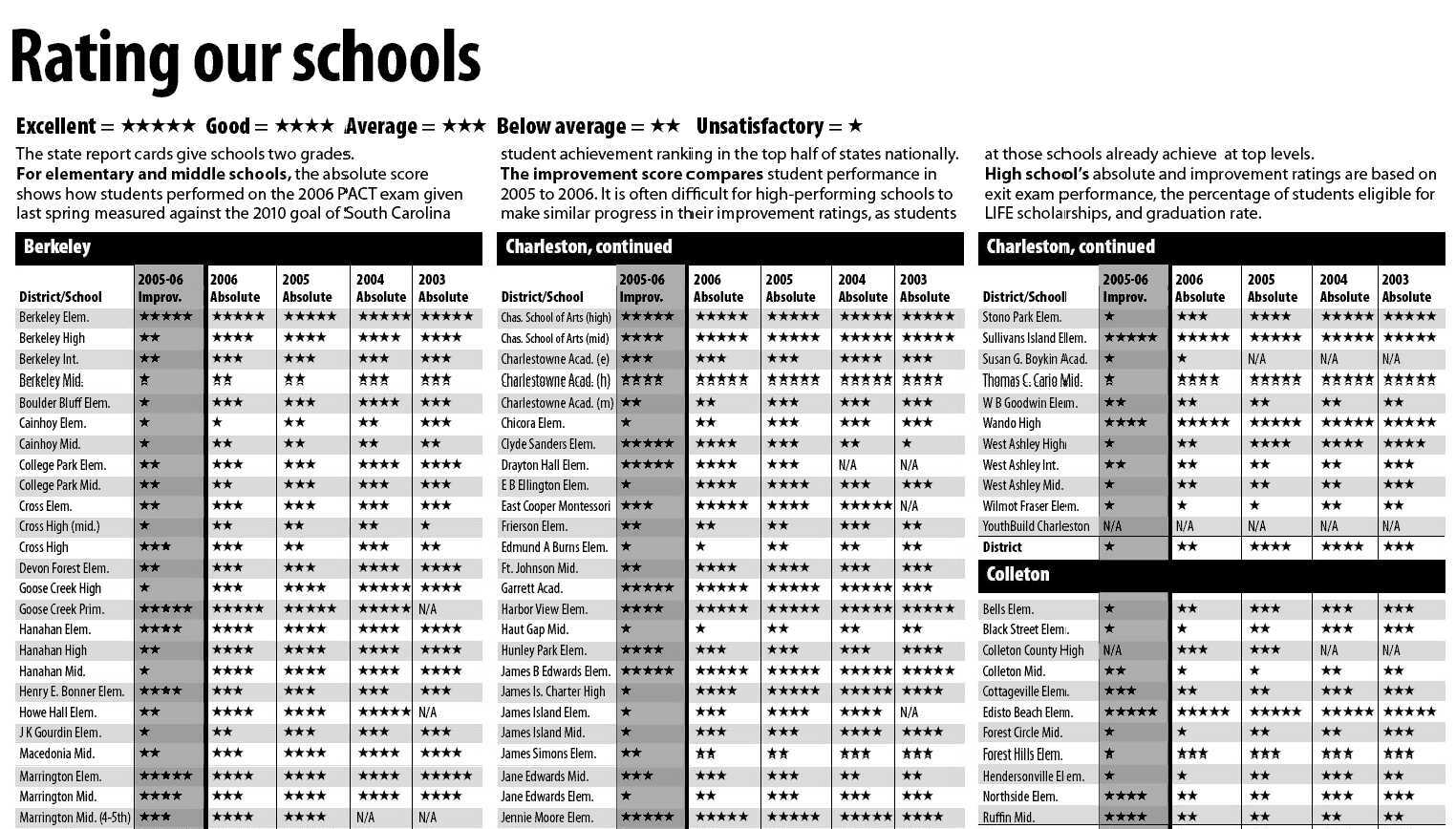
Flickr supplies more breadcrumbs, two of them a month apart. In November 2006 I posted a newspaper page I had laid out: every school in five South Carolina districts, rated across four years of state report cards.
South Carolina published words rather than numbers: excellent, good, average, below average, unsatisfactory, for every school, four years running. Words do not stack up. You cannot skim two hundred of them and come away with a shape. Stars you can count, and counting is what a parent looking for their own school actually does.
A month later I uploaded a close-up of a pinched letterform: I was already stopping to admire ink traps in 2006. Something I found myself dwelling on again twelve years later, when considering fonts for digital data.
The next many years would be consumed by TheDigitel.com, an excellent if poorly timed idea for hyperlocal news that I co-founded (2008 was bad for the entire economy, advertiser budgets included). I won't digress into that; it is a full-on post of its own.
Reading the archive instead of scrolling it#
I finally parted ways with TheDigitel in 2011, taking a job offer in Germany, and resurfaced writing on this site in 2013. It now contains roughly a hundred entries written on and off across different jobs, tools and versions of the site. That is a mineable pool: enough to compare topics and surface passages that resemble one another. It is also enough for a conventional reverse-chronological blog to hide most of what is there.
This 2026 redesign began with typography, graph paper and a more technical datasheet vocabulary. Posts gained document references. The archive gained a timeline, while topic pages and small activity charts made it possible to browse by subject rather than only by publication date.
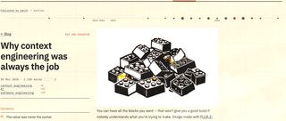
A blog normally asks, "What did I publish most recently?" A register asks, "What is here, and how does one thing relate to another?"
The newest entry is not necessarily the best way into the work. A 2017 post about information architecture leads more naturally to a 2026 argument about content delivery than to whatever happened to be published between them. A type experiment from 2018 makes more sense beside later work on data fonts and embedded SVG text.
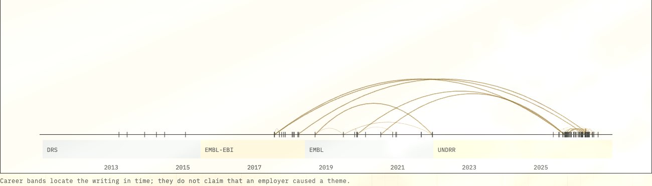
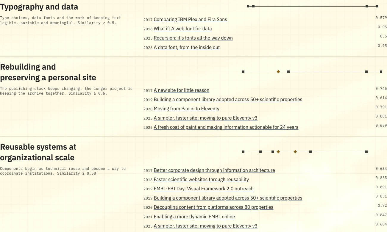
My little demo that I've called the "Corpus Story Lab" tests those readings. One view stacks every topic as its own line, so it is possible to see when each was active and which ones came back. Another view assembles "biographies" from a few editorial anchor posts and the entries closest to them in meaning.
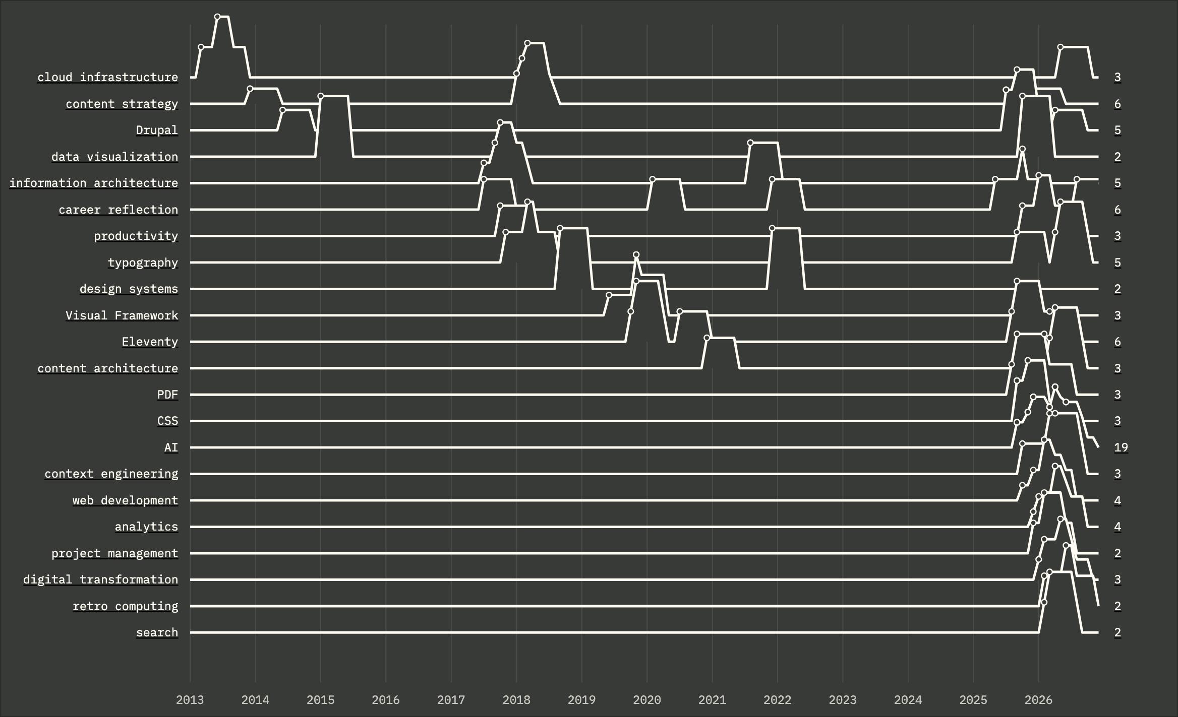
That typography biography currently begins with writing from 2017 and 2018. The Flickr photograph shows why the larger archive matters: the visualization is not wrong, but its corpus is incomplete.
Similarity, meaningfully#
This site has a semantic search index which I've used to connect repeated language and adjacent subject matter. It does not show that one idea caused another, that an employer shaped a topic, or even that I consciously remembered an older post while writing a newer one. It also only knows what I have published here: drafts, navigation and everything off-site never enter it, so its totals sit below the topic counts and the decade before 2013 barely registers. The map is candid about its own gaps, and that turns out to be the useful part.
Compounding this, much of the meaning I'd like to draw from still lives elsewhere:
- more than a thousand photographs in my Flickr archive, which should not remain their only home;
- writing published through employers, projects and publications that now lives on sites I do not control;
- small tools and experiments spread across my GitHub repositories;
- older versions of this site preserved unevenly in Git history and the Wayback Machine.
The role I want for this site is an index across them: photographs, projects and recovered articles, each carrying its date, its original context and a link back to where it first appeared.
Photography is the part I most want to bring back as an active practice, not only a rescue operation. The current archive is heavily weighted toward words and software.
The site has been rebuilt several times, each migration about the machinery: Drupal, Gulp, Panini, Eleventy, then a much simpler Eleventy stack. This rebuild started with a question about myself instead: how to say what I do without reaching for "person who translates between technical and non-technical people," which is a real skill and a hopeless title.
I have settled, for now, on Digital Platforms & Audience Engagement Lead, but the longer winded, and truer, version is the through line the record keeps showing me: not a platform, not a publishing habit, but repeated efforts to make information legible, navigable, impactful and connected, for the people reading it and increasingly for the machines reading on their behalf.
The fresh coat of paint is fun. The datasheet vocabulary, the timeline and the Story Lab are there to make this collection legible, not just recent.
Twenty years ago I turned two hundred words the state would not add up into a column of stars a parent could count at a glance. This is the same move, pointed at myself: taking a career that only ever arrived one post at a time and arranging it so the shape is finally countable. That is why the archive is worth keeping: enough context to see the shape, and enough structure to keep following it.
I look forward to refining this, and hopefully that refines me.
