In the quest of middle age, I've been emulating Mac OS 9 and getting Johnny Castaway running in a browser. Playing board games with my kids has me revisiting more of that stuff too. I have a rant brewing about the quality of The Game of Life these days, but that can wait.
The '90s seem to be back in style, though much of what I notice is the grungier side: distressed type and rough textures. I keep going back to the chaotic graphics on Japanese Sonic covers and TurboGrafx-16 ads. I always thought these were impressive. On the Sonic covers, enormous lettering, bright colours, squiggles and zigzag edges all fit around a character who already takes up most of the cover.
I wanted some of that personality here. I'd only recently redesigned the site, and the analytical style suited my work, but it felt too clinical for my own blog.
tl;dr
- Japanese Sonic covers supplied the yellow disc, bold colour fields, compressed type and patterned edges.
- A TurboGrafx-16 ad suggested a cut-paper treatment for selected images.
- The homepage gets the expressive composition; the articles keep a clear reading column and upright text.
From a datasheet to a cover#
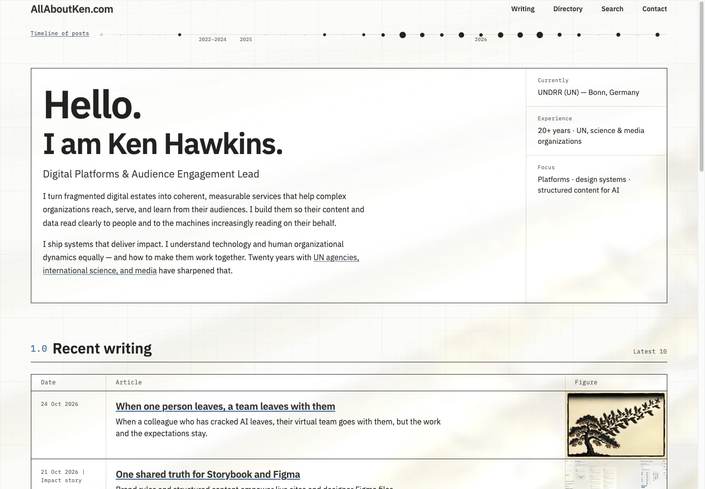
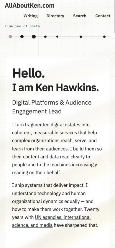
My redesign this summer brought a heavy data angle: graph paper, numbered sections, small labels and rules around most things. By the time I'd added them all, the homepage looked like a technical document.
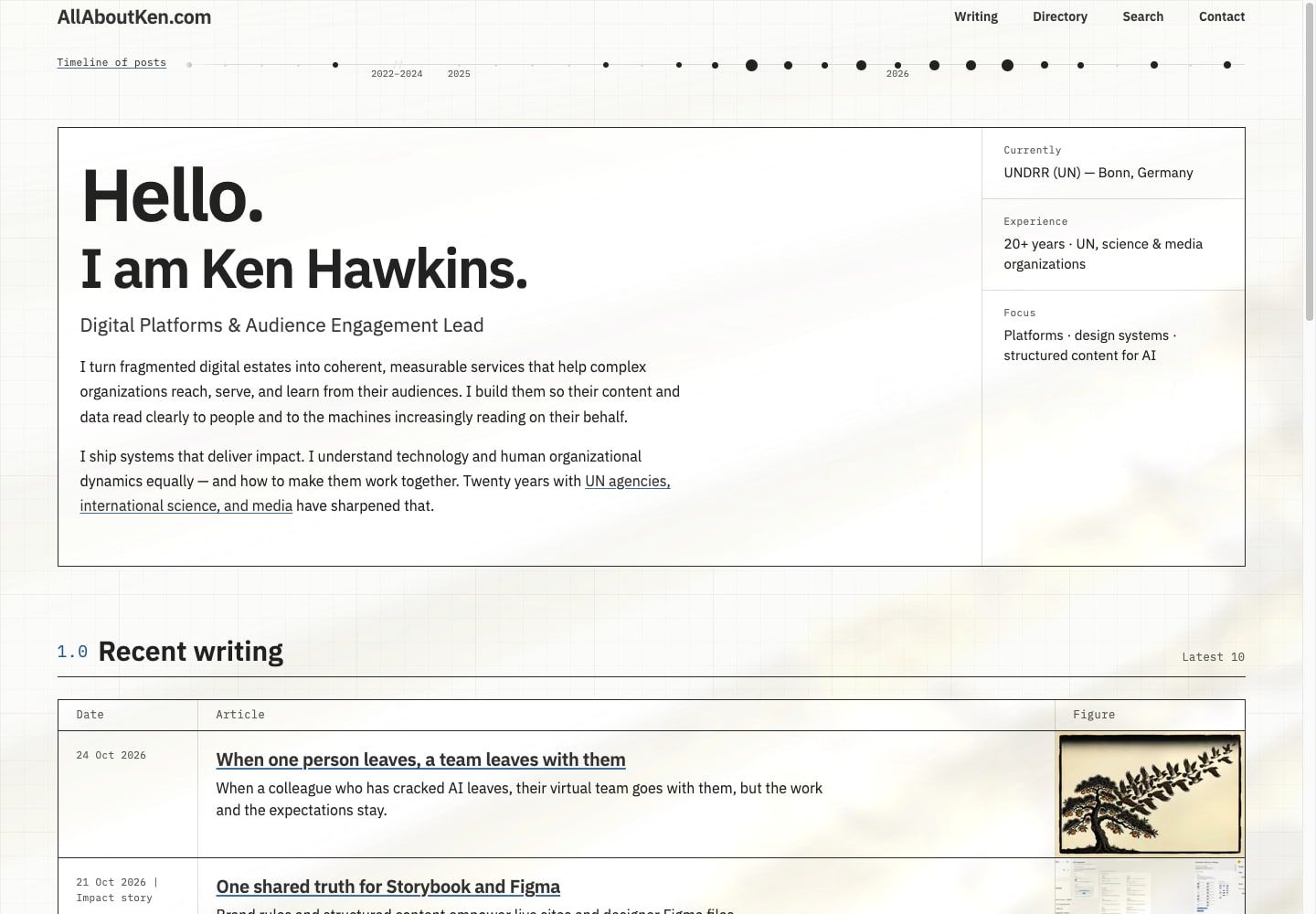
I tried removing the boxy frames. That helped, but I still wanted to loosen it up.
Cartridge covers gave me something to work with: big type, a few strong colours and room for things to overlap. Having worked in newspaper graphics and print production, I also liked thinking of the homepage as a cover with the writing behind it.
What came across from the packaging#
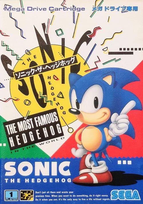
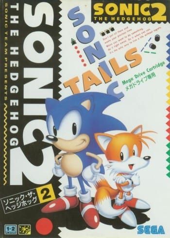
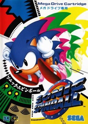
Japanese Mega Drive covers, reproduced as design references. Artwork and branding © SEGA. Credits and sources.
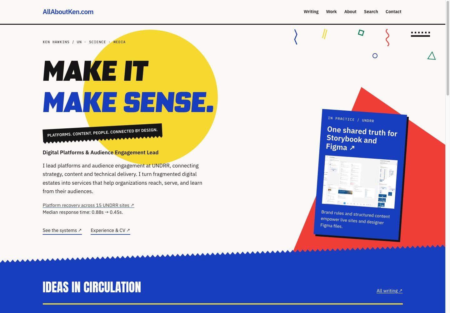
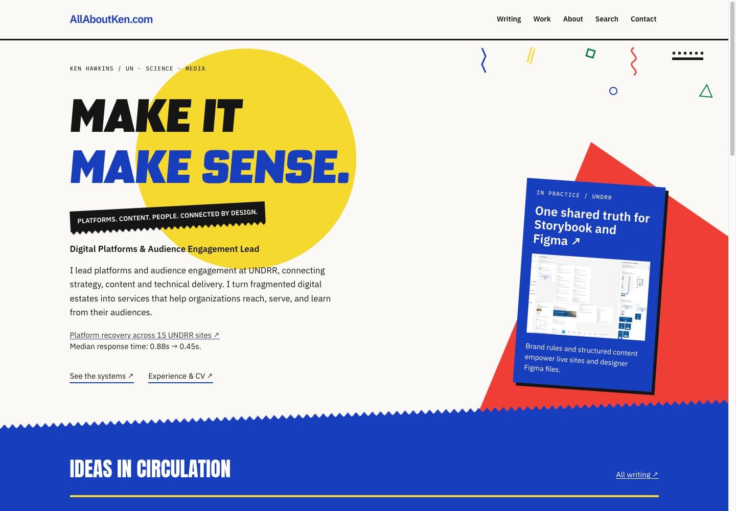
I borrowed the yellow disc for the headline, with the first line in black and the second in cobalt. The short description of what I do sits on a black ribbon: “Platforms. Content. People. Connected by design.” A red diagonal sits behind the blue project card.
The squiggles, triangles and serrated edges were fun to work with. Some turned up around code blocks and quotations too, with the decoration kept out of the text itself.
The homepage headline uses Science Gothic. Its letterforms already lean, so I kept the baseline level and left the rotation to the ribbon and project plate. The homepage uses a small, fixed subset rather than the complete variable font.
Give the introduction something to point at#
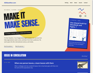
The homepage still needs to explain what I do. Beside “Make it make sense”, I've put a project card linking to my work at UNDRR connecting Storybook, structured content, design tokens, and Figma. It pulls its title, image and description from the published entry.
Below that are the six latest entries, under “Ideas in circulation”, with dates, short descriptions and thumbnails. The links to writing, work, my profile and search are still at the top.
A second reference: fragments on paper#
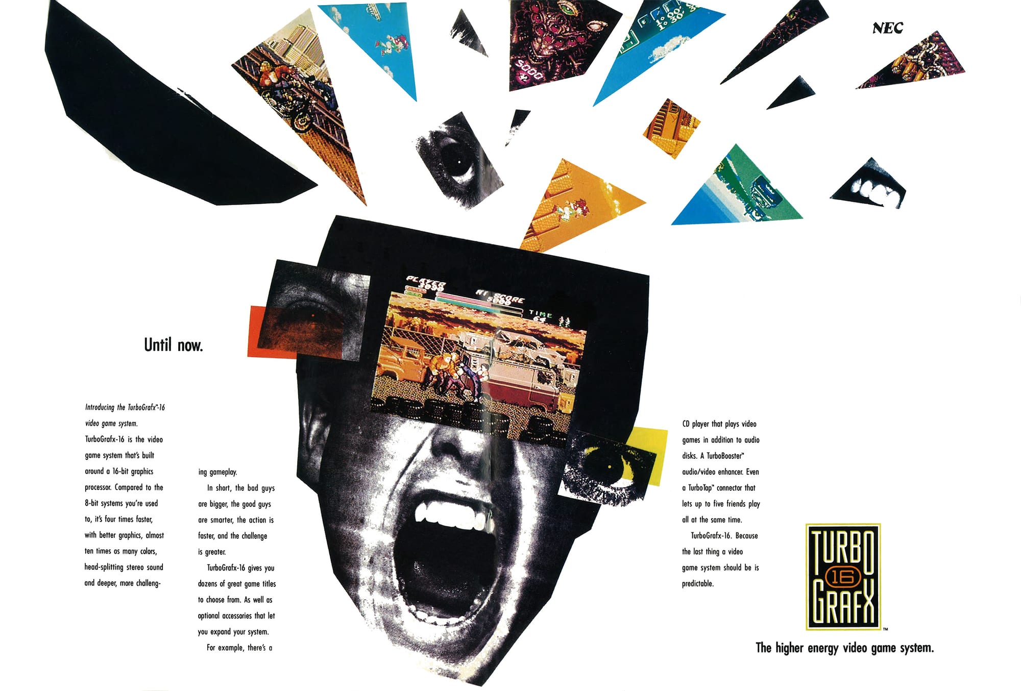
I also had a TurboGrafx-16 growing up and loved it and its personality. This ad in Electronic Gaming Monthly caught my eye too: a face and game screenshots cut into odd shapes, with bits of red and yellow overlapping them. There is a lot happening, but also a surprising amount of empty paper.
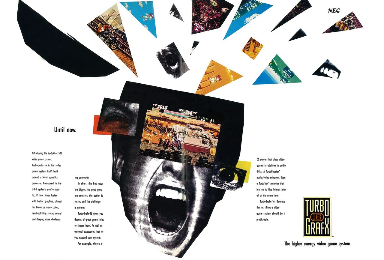
TurboGrafx advertising ranged from sophisticated to childish. Christian Nutt's oral history follows the change from NEC to Turbo Technologies Inc. (TTI), including the later Johnny Turbo comic-book ads. What I wanted from this particular spread was the fractured photograph, the sharp cuts and the space around the pieces.
The cut-paper collage study applies that composition to a screenshot of the Mangrove Figma library, with cropped details and a black shape behind it. The whole screenshot is still there to look at.
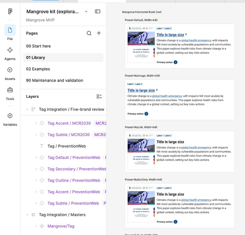
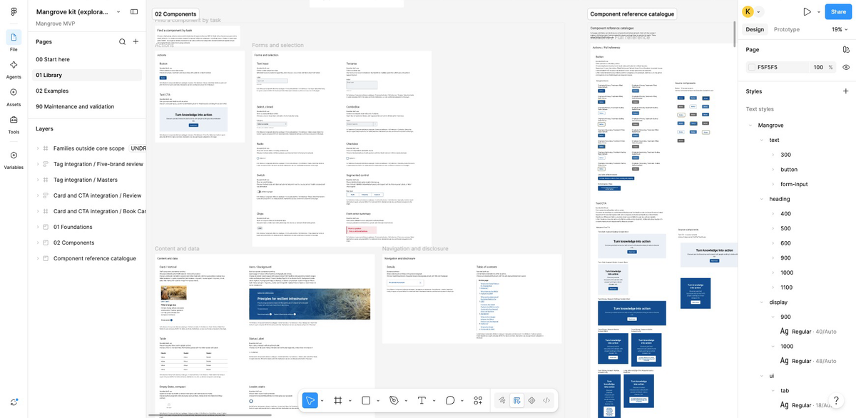
It's now an optional figure treatment, used here and in the Johnny Castaway article.
How the collage works#
kh-collage is ordinary HTML and CSS. A Nunjucks macro puts the complete image in front of three decorative copies, taken from either that image or a separate detail shot. CSS positions those copies around it and cuts their edges with clip-path. One static fragment looks like this:
.kh-collage__fragment--a {
  clip-path: polygon(0 0, 100% 22%, 76% 100%);
  transform: rotate(-12deg);
}
The optional parallax is a small script that maps the pointer position to two CSS custom properties, --kh-collage-x and --kh-collage-y. Each layer multiplies those values by a different distance in its transform, so the pieces move different amounts. Updates use requestAnimationFrame. Nothing is being redrawn into a canvas or generated as you move the pointer.
The caption stays still. Decorative copies have empty alt text and are hidden from assistive technology. Touch devices and reduced-motion settings get the static composition; switching CSS off leaves the main image and caption. The component reference includes the macro call and implementation details.
Let the article settle down#
I kept most of the decoration around the edges of the article layout. The title gets the yellow disc and condensed type; the paragraphs sit on near-white paper in Plex Sans. The contents list is a native HTML disclosure, so opening it doesn't need a script.
Anton handles the other display headings, Plex Sans the paragraphs and controls, and League Mono the code and small labels. The fonts are self-hosted.
The circle and diagonals are CSS shapes. SVG assets supply the margin marks and serrated edges. Most of the presentation works without JavaScript; the optional collage parallax is a small enhancement.
A site I recognise#
The analytical bits of the site are still there. I just wanted it to look a bit less corporate and a bit more like somewhere I'd choose to spend time.
CSS is still optional. The CSS toggle I wrote about last year removes the styling, leaving native HTML. The text remains readable, links work and the contents list still opens.
Artwork and further references#
- Sonic packaging: Yoichi Takahashi's account of the original packages, including his commission of Akira Watanabe's character illustrations. Hayato Takebayashi's own post confirms his Spinball packaging credit. VGDensetsu records the covers and detailed illustration credits. Artwork and branding © SEGA.
- TurboGrafx-16 print ad: Electronic Gaming Monthly #2, July/August 1989, via TurboPlay Magazine Archives. Individual design and art-direction credits remain unconfirmed. Television Digest, 2 October 1989, p. 13, names DDB Needham as the campaign agency that October; it does not credit this spread.
- A later graphic comparison: SEGA's Sonic Origins Plus Japanese cover returns to the yellow disc, tilted labels, geometric marks and serrated edge.