One shared truth for Storybook and Figma
Brand rules and structured content empower live sites and designer Figma files.
Each dot is one thing the plugin reads. As the story names them, they gather: the content schemas, the 540 brand variables (69 of them set per brand, in blue) and the 25 component families; the 297 component variants it writes arrive with Figma.
Figma kits often tell a design system's story a second time. Designers draw the components, engineers build them, and the two versions drift because nothing ties one to the other. Every correction gets made twice, by different people, or often doesn't and the two worlds drift. Double the work and half the benefit.
UNDRR's Mangrove Figma library is derived instead: a change made once lands everywhere. When I changed a core spacing value in code and republished, a designer's pilot file updated and kept every one of their edits. Nobody redrew anything or compared design and code by eye.
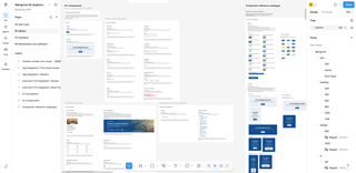
My solution for UNDRR works because three sources already agree on how truth is told. The content rules (structured content schemas) say what each component contains, the brand settings (design tokens) say how it looks in each of UNDRR's five brands, and the developers' live component catalogue (Storybook) says how it is laid out. A plugin built to this architecture reads all three and generates a native Figma library: 297 variants in 25 component families, real components rather than pictures of them.
That is triangulation: each source answers one question. So when Figma disagreed with one of them, I knew which, and every mismatch became a bug with an address instead of an argument about taste.
Why isn't this a solved problem?#
Storybook and Figma only look as if they do the same job. Both show a design system's components, so it seems they should stay in step on their own. They don't, for the same reason a Windows app doesn't simply run on a Mac: each platform lays things out and behaves in its own way, and Figma's Auto Layout is not CSS.
There is no standard way across. Every system has its own components, brands and edge cases, so any conversion depends on what you start from. Most teams settle for a degree of parity between the two, or accept that the front end is the real source of truth and update Figma by hand to keep up.
Hard, but not impossible. Separate what a component is from how it looks and how it is laid out, and most of the port becomes mechanical. That is also where AI helps. The work is reverse engineering: rebuilding something that already exists in another platform's terms, with the original there to check every result against.
Where did the truth come from?#
The hard part was as much the culture change as the technical build. Getting a broad range of stakeholders to agree on what a card, a hero or a landing page is made of took years of sustained leadership: I led the initiative across our content teams, developers and organizational leadership to shift perspectives. That meant getting teams to embrace abstraction: content schemas for structure, design tokens for appearance, and code for layout. By the time a Figma library came up, that discipline was already settled and empowering live syndication. (I've written about Mangrove as a content architecture that happens to ship a design system.)
The brand settings are a second, independent source. I led the effort to align the structure of the design tokens across UNDRR, PreventionWeb, MCR2030, DELTA Resilience and IRP into one unified set, which the plugin turns into 540 Figma variables. 471 of them (87.2%) are the same in every brand; the other 69 are where the brands differ: colour, corner radius, a softer surface here, hero spacing there.
Neither source needs to know about the other. A schema says nothing about colour, and a token says nothing about whether a card has an image. So you can hold one still and swap the other: below, the same Book Card schema under each brand's tokens.
Hold the content, swap the brand
Switch brands on the Book Card. The content stays the same throughout: brand settings change how it looks, and Storybook decides how it is laid out.
The interactive brand switcher needs JavaScript. In short: 471 of 540 Figma variables (87.2%) are the same in all five brands; the rest change colour, corners and button sizing without changing what the card is made of.
What does Storybook add?#
Layout, and only layout. I led our front-end developers in building Mangrove out, and directed the work with engineering teams to integrate it across our live sites. Storybook is the working catalogue of that initiative: each pattern takes a schema's fields and the tokens' values and arranges them on a page. That arrangement is the one thing Storybook has the final word on.
The Book Card shows the split. Its four presets, including a version without an image, come from the schema, and its colour, type and spacing from the tokens. Where the boxes land is Storybook's call, and an automated geometry check measures against it.
Everything after this depends on that split. Each source owns one question, so each can be checked on that question alone.
How is the Figma library built?#
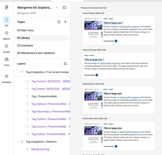
The plugin asks each source the question it owns. Field lists and presets come from the schemas, values bind to Figma variables generated from the tokens, and geometry is checked against Storybook. Nothing in the library is authored in Figma: a designer switching the Book Card to its no-image preset is choosing one the schema already allows.
I directed AI coding agents to write most of the plugin, and the structure gave their work a right answer. The agents traced tokens through the code and generated the build instructions for each component, and every instruction could be checked against one of the three sources. Their output still had errors. The difference was that I could trace each one.
What happened when the sources disagreed?#
Real output found the bugs; the sources told me where they lived. The automated tests all passed. The problems only showed up when I opened the generated components in Figma and inspected them.
Tokens against Figma: an invisible disabled control. The disabled ComboBox vanished in Figma. The converter had passed the opacity token 0.55 into a field expecting a percentage, so 55% became 0.55%. The token and Storybook agreed with each other, which put the fault on the converter. I fixed it, and the test harness that had missed it.
Storybook against Figma: text spacing that drifted. Small help text sat slightly differently in Figma than in the browser. Layout is Storybook's call, so I measured the line height in the browser and calibrated Figma to it.
The third mismatch was in a source. Real disaster risk data in the Table ran into fixed dividers in Figma and Storybook alike: both were faithful, but the schema had no length limit. I worked with colleagues to establish the limit and wrapping rules in the component guidance, and both now inherit them. Deriving a library from its sources can find gaps in the sources too.
What did a token change prove?#
A change at the source carries through to designers' work. I changed a core UNDRR spacing token from 30px to 32px and republished the library. In a pilot file of 56 linked library instances, a resource page at desktop and mobile widths, the layout updated and every edited title, chosen preset and instance override survived.
Designers don't need the plugin to use the library. I led the adoption effort with our design team, ensuring this architecture empowered their craft rather than dictating it. The pilot was built entirely from the published library, with its own headings and local notes; the plugin is a build tool behind the scenes, and designers only ever touch the library.
What does it cost to keep?#
Less than redrawing by hand, but not free. The plugin and its tests come to about 77,000 lines of code, over 40% of it tests and audits, and someone has to keep that working as the product changes.
So I established a sustainable operating model. Brand settings sync automatically, because they are cheap to keep current. Full rebuilds of the library wait for major versions and new components. With rebuilds that infrequent, a paid tool such as story.to.design didn't make sense for us.
It only holds while Figma stays downstream. Copy, presets and visibility in a designer's own file belong to them. Edits to the shared library itself would turn Figma back into a second story. That needs a policy before the next rebuild, and there isn't one yet.
Why did this work?#
The technical build rested on years of culture change. If the schemas and tokens had been vague, the plugin would have had nothing to triangulate from, and the agents' output nothing to be checked against. Getting stakeholders across editorial, engineering and design to embrace these layers of abstraction took sustained leadership: the plugin simply harvested the alignment we had already built.
Managing my team meant holding the technical contracts; leading across teams meant building trust. Content authors needed confidence that schemas would protect their publishing workflows; developers needed patterns they could rely on in production; designers needed Figma components that respected their autonomy.
Each discipline gets the same story in its own tool. Designers get Figma and developers get Storybook, both drawing on the same content rules and brand settings. It's the same move I made in putting analytics into editorial workflows: meet each team in the tool it already works in.
What one shared truth reaches
-
2,700 brand values
5 brands × 540 Figma variables (471 shared, 69 by brand)
-
110 styles
102 text, 8 effects
-
297 variants
in 25 component families
-
56 linked instances
in a designer's pilot file, every edit kept through a token change
Built with about 77,000 lines of code, 33,000 of them tests and audits.
